Daxton Concrete
Brand Identity Design
Client: Daxton Concrete
Sector: Construction / Industrial
Service Provided: Logo Design, Business Card Design, Brand Collateral
Daxton Concrete, a company known for precision, resilience, and structural excellence, needed a bold and professional brand identity to reflect its industry values. My goal was to create a visual identity that communicates strength, durability, and reliability—the same qualities expected in concrete.
Design Concept:
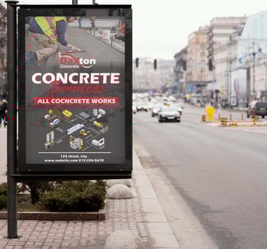
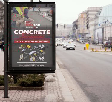
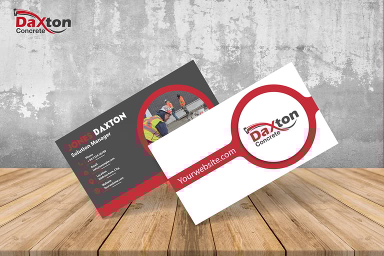
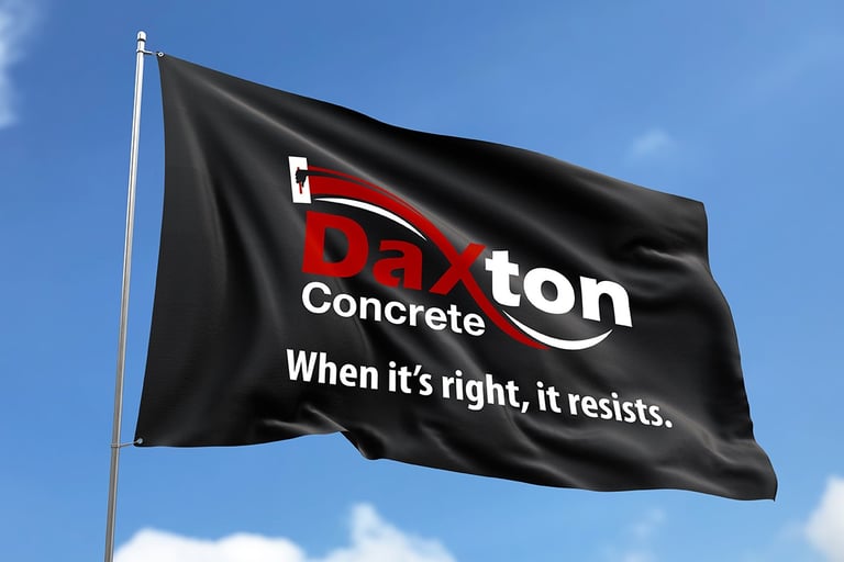
Logo: A custom wordmark combining bold, strong typography with a dynamic red arc symbolizing motion, progress, and structural support.
Color Palette: Red, black, and white – a powerful and timeless combination reflecting strength, clarity, and authority.
Typography: A modern serif-sans pairing to balance professionalism with approachability.
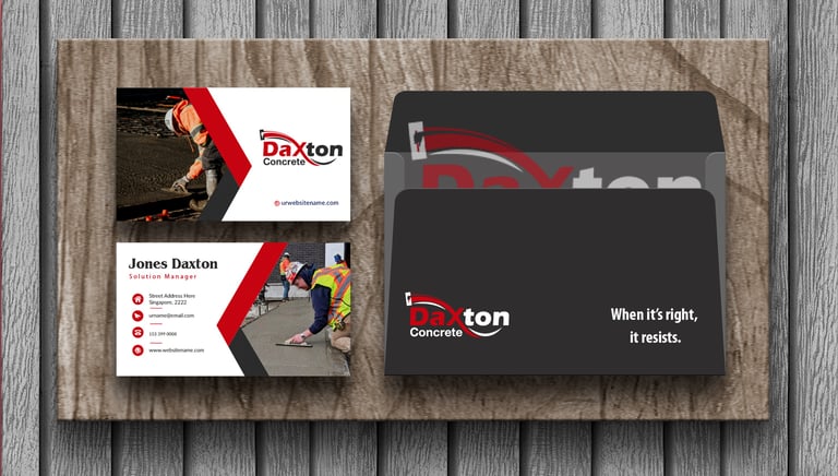
Tagline: "When it’s right, it resists." – a confident statement about the brand's promise of durability and excellence.
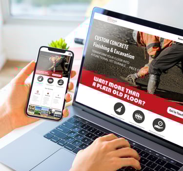
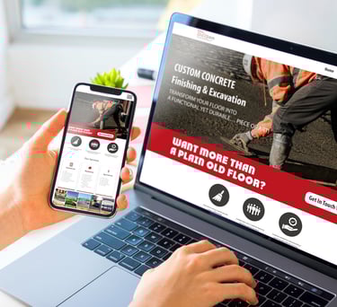
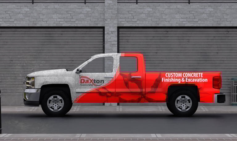
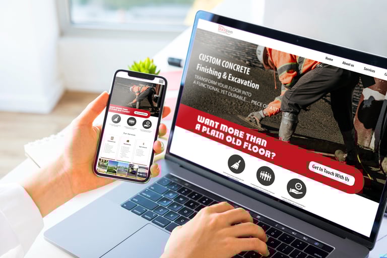
Brand Collateral:
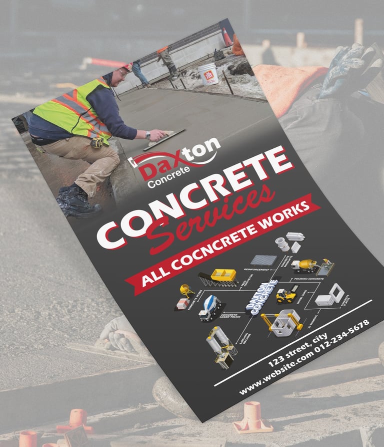
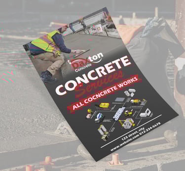
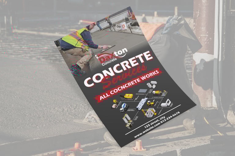
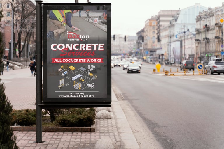
Professionally crafted business cards and corporate folders that use real construction imagery to connect emotionally with the client’s target audience.
Clean layouts designed to impress while staying true to construction aesthetics.
Why It Works:
This identity positions Daxton Concrete as a trusted, quality-focused partner in the construction industry. The brand tells a story of resilience and precision, inspiring confidence in every touchpoint.
Want branding like this?
Whether you're in construction, logistics, or beyond – I help businesses build strong, lasting visual identities.
Contact me now to elevate your brand with design that resists time and competition.