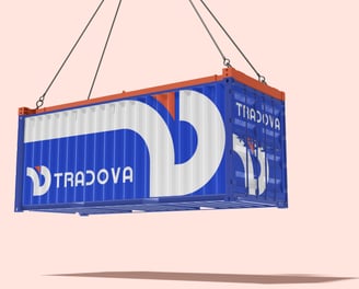
TRADOVA Logistics Branding Project
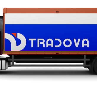
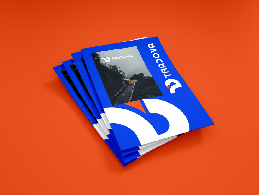
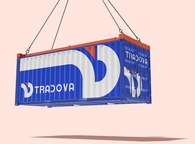
TRADOVA is a logistics company specializing in efficient transportation and supply chain solutions. This branding project establishes their visual identity with a focus on professionalism, reliability, and movement.
The branding combines:
Strong geometric forms suggesting precision and efficiency
A vibrant color contrast that ensures visibility
Typography that balances modernity with approachability
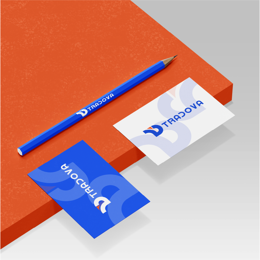
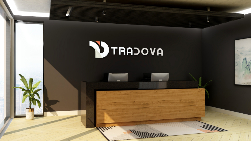
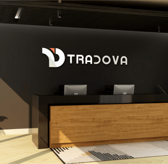
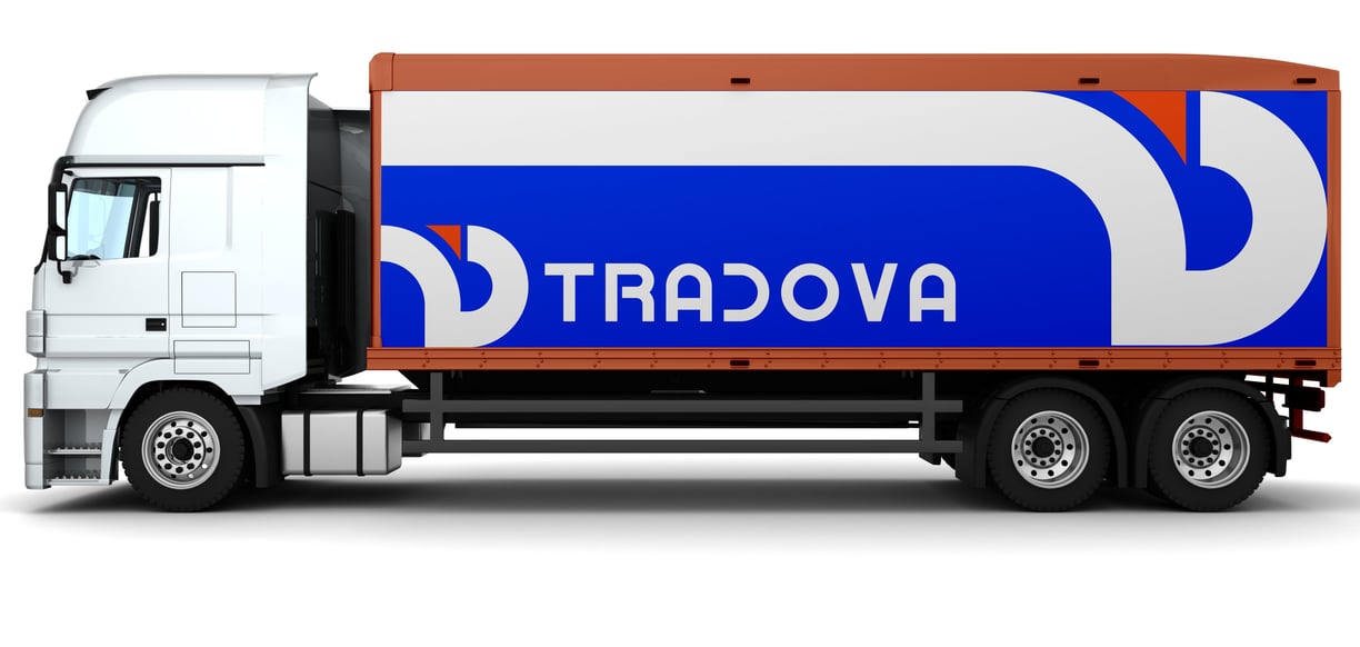
Multiple lockups for versatile application across touchpoints
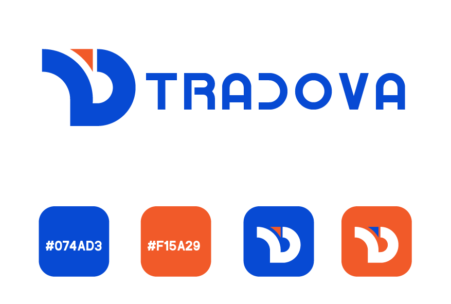
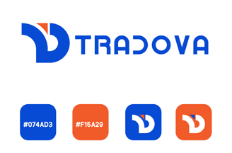
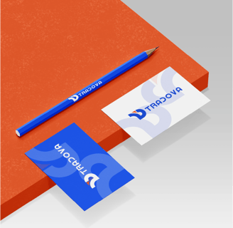
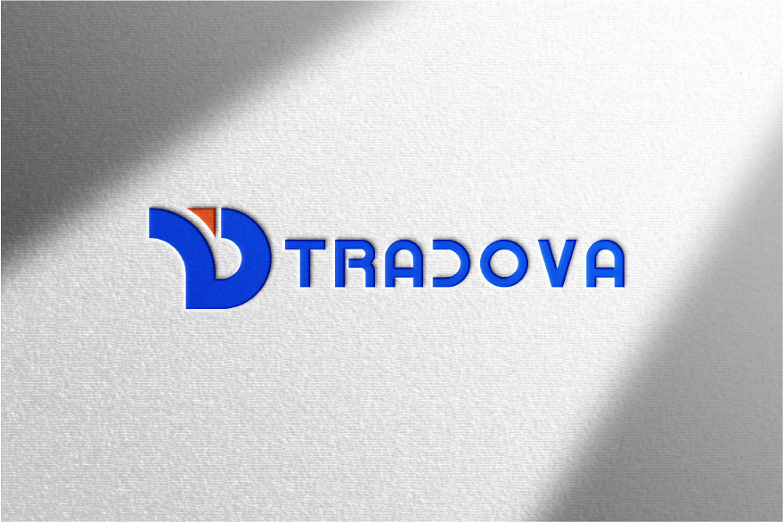
Color Palette
Primary Blue: #074AD3 (represents trust, reliability, and professionalism)
Secondary Orange: #F15A29 (symbolizes energy, action, and dynamism)
Typography
The logo features a clean, modern typographic treatment with:
"TRADOVA" as the primary wordmark
Variations including "TRADOVA" (possibly for international versions)
The "TD" monogram (likely representing a parent company or division)
Logo Variations
The project includes several logo configurations:
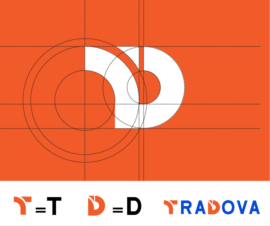
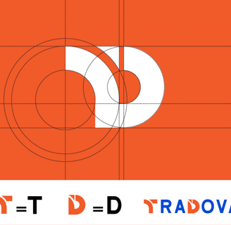
Simple "T = T / D = D" concept with "TRADOVA" (possibly an early concept)
Standard "TRADOVA" wordmark (appears twice for balance)
"TRADOVA" combination (potentially for different markets)
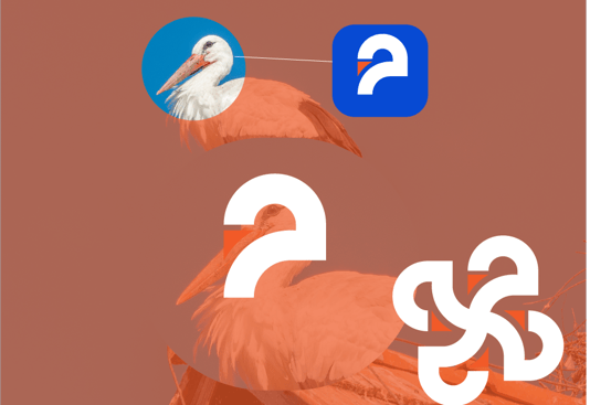
"Stork Head" version (for specific applications)